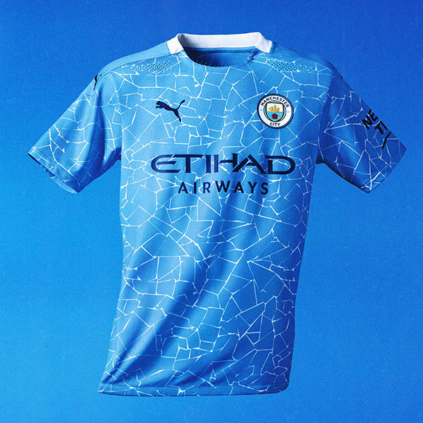
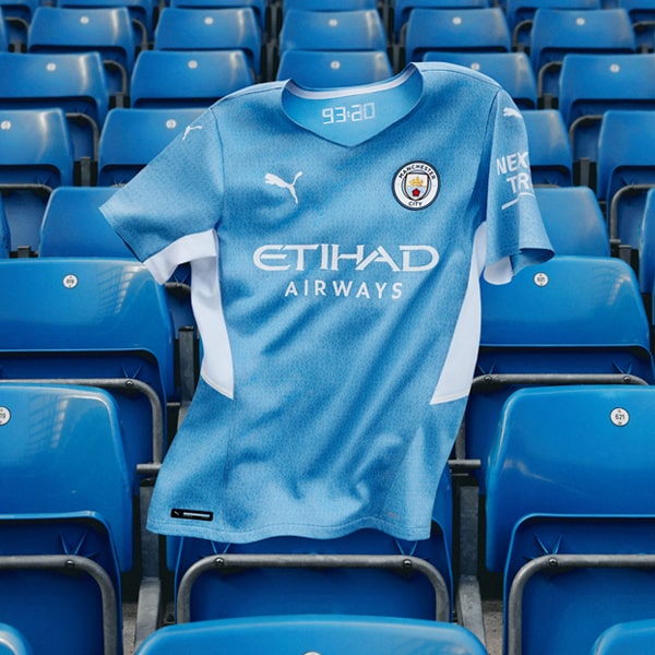
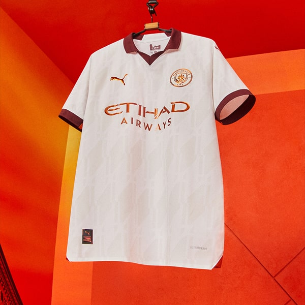
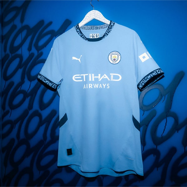
Taking inspiration from the Colin Bell-led side of the late 60s and early 70s, PUMA launch the Manchester City 22/23 home shirt, which sees the traditional sky blue joined by Maroon trim, a look synonymous with that highly successful era.
While football fans across the world eagerly await what is set to be a dramatic final day of the season, in which Manchester City will look to retain their Premier League crown, PUMA take the opportunity to look ahead, unveiling the club’s new home shirt for the 22/23 season. Calling back to the glory days of 1967 to 1971 – an era in which no team could match the style and swagger of City; their pass-and-move, end-to-end attacking football leading to the side winning every domestic title and topping it off with a European cup – the shirt is inspired by the classic designs of that time.
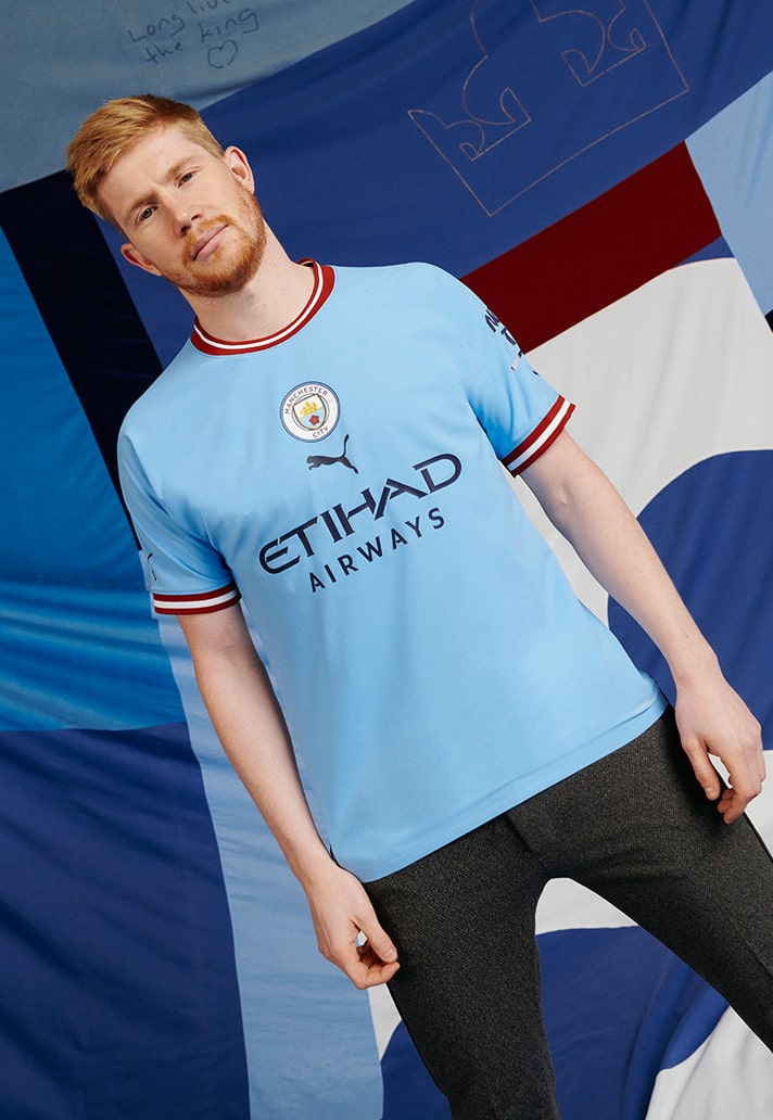

The team of the late 60s and early 70s was led by club icon, Colin Bell, and the design here pays tribute to the legendary player, echoing the classic designs from his era by placing the club crest at the centre along with maroon trims on the collar and sleeve cuffs. As a final nod to Bell, known to fans as “Colin the King”, a crown logo appears inside the neckline.
“The new Manchester Home kit is a fitting tribute to classic City Home kits styles of the past. We wanted to create a modern spin on the jerseys worn between 1967 to 1971,” said Marco Mueller, Senior Head of Product Line Management Teamsport Apparel. “The maroon trim was an important detail because this was an iconic color seen on many of the previous City Home kits. The jersey is a great homage to the entertaining teams of old and the exciting free-flowing football of the current City team.”
Jon Bell, Colin’s son, said, “As a family, we’re incredibly touched that the club and PUMA have chosen to remember the teams of the late 1960’s and my dad with next season’s Home kit – it’s a beautiful gesture. It really captures the history and togetherness of Manchester City as a club, and I hope the fans like it and can remember those great moments.”


Pick up the Manchester City 22/23 home shirt at prodirectsoccer.com